Panic Copula
panic_copula.Rmd
library(cma)
library(dplyr, warn.conflicts = FALSE)

# stationarity - "invariance"
x <- matrix(diff(log(EuStockMarkets)), ncol = 4)
colnames(x) <- colnames(EuStockMarkets)
head(x)
#>               DAX          SMI          CAC         FTSE
#> [1,] -0.009326550  0.006178360 -0.012658756  0.006770286
#> [2,] -0.004422175 -0.005880448 -0.018740638 -0.004889587
#> [3,]  0.009003794  0.003271184 -0.005779182  0.009027020
#> [4,] -0.001778217  0.001483372  0.008743353  0.005771847
#> [5,] -0.004676712 -0.008933417 -0.005120160 -0.007230164
#> [6,]  0.012427042  0.006737244  0.011714353  0.008517217
Assume there is a portfolio of stocks that is equally weighted on the indexes that appears in object x.
The main statistics of the P&L can be seen with empirical_stats():
empirical_stats(pnl)
#> # A tibble: 6 × 3
#>   stat  name         value
#>   <fct> <chr>        <dbl>
#> 1 Mu    base_pnl  0.000585
#> 2 Std   base_pnl  0.00832
#> 3 Skew  base_pnl -0.583
#> 4 Kurt  base_pnl  7.83
#> 5 VaR   base_pnl  0.0223
#> 6 CVaR  base_pnl  0.0302
The big question here is: how would the P&L statistics change in response to a massive sell-off?
To address this question we follow A New Breed for Copulas for Risk and Portfolio Management and model the market as a mixture of “calm” vs. “panic” distributions. For details on the full specification of this market, please, see the reference above.
# For the details on how the market is modeled, please, see the paper:
# "A New Breed for Copulas for Risk and Portfolio Management"
panic <- panic_copula(x, n = 50000, panic_cor = 0.97, panic_prob = 0.02, dist = "normal")
calm  <- panic_copula(x, n = 50000, panic_cor = 0.00, panic_prob = 0.00, dist = "normal")
We simulate 50.000 scenarios that matches the normal distribution exactly, with the sample counterparts of \(\mu\) and \(\sigma\).
In the first scenario we assume there is a 2% probability of panic, in which all the cross-correlations are equal to 0.97. We also model a “calm” scenario without changing the historical correlation structure.
For consistency, we continue with an equal-weight strategy for both simulations:
# Equal-Weight Portfolio Under the Panic Market
pnl_panic <- tibble::tibble(
  pnl_panic = as.matrix(panic$simulation) %*% w
)

# Equal-Weight Portfolio Under the Calm Market
pnl_calm <- tibble::tibble(
  pnl_calm = as.matrix(calm$simulation) %*% w
)
The “panic” P&L can be seen with plot_panic_distribution():
# PnL under the Panic Regime
plot_panic_distribution(pnl_panic, panic$p, breaks = 200)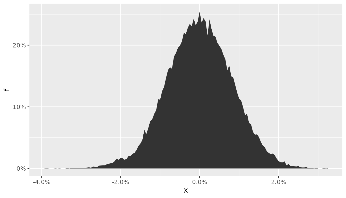
The new marginal distribution shows a hump shape format around -2%, which is a direct consequence of the panic. Nevertheless, the location and dispersion still matches the sample counterparts. The panic is hidden!
The full picture - with the similarities and differences - among these markets can be seen with help of ggplot2:
stats_panic <- empirical_stats(pnl_panic)
stats_calm  <- empirical_stats(pnl_calm)

bind_rows(stats_panic, stats_calm) |>
  ggplot2::ggplot(ggplot2::aes(x = stat, y = value, fill = name)) +
  ggplot2::geom_col(position = "dodge") +
  ggplot2::facet_wrap(~ stat, scales = "free") +
  ggplot2::labs(x = NULL, y = NULL, fill = "regime") +
  ggplot2::scale_fill_viridis_d()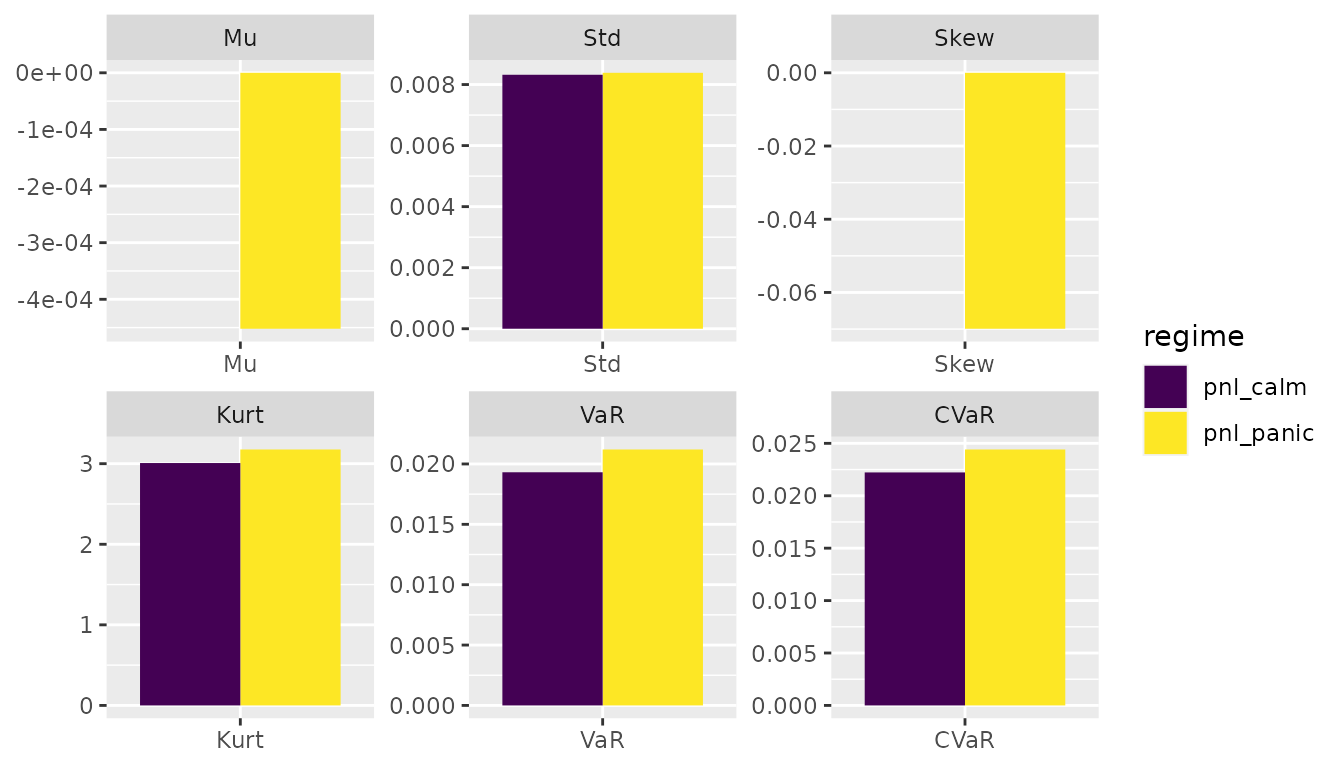
While the location and dispersion doesn’t change, all the other metrics are twisted for markets that operate under multiple regimes. The objects stats_panic and stats_calm imply that a 2% probability of panic increases the kurtosis by 6% and VaR and CVaR by 10%.